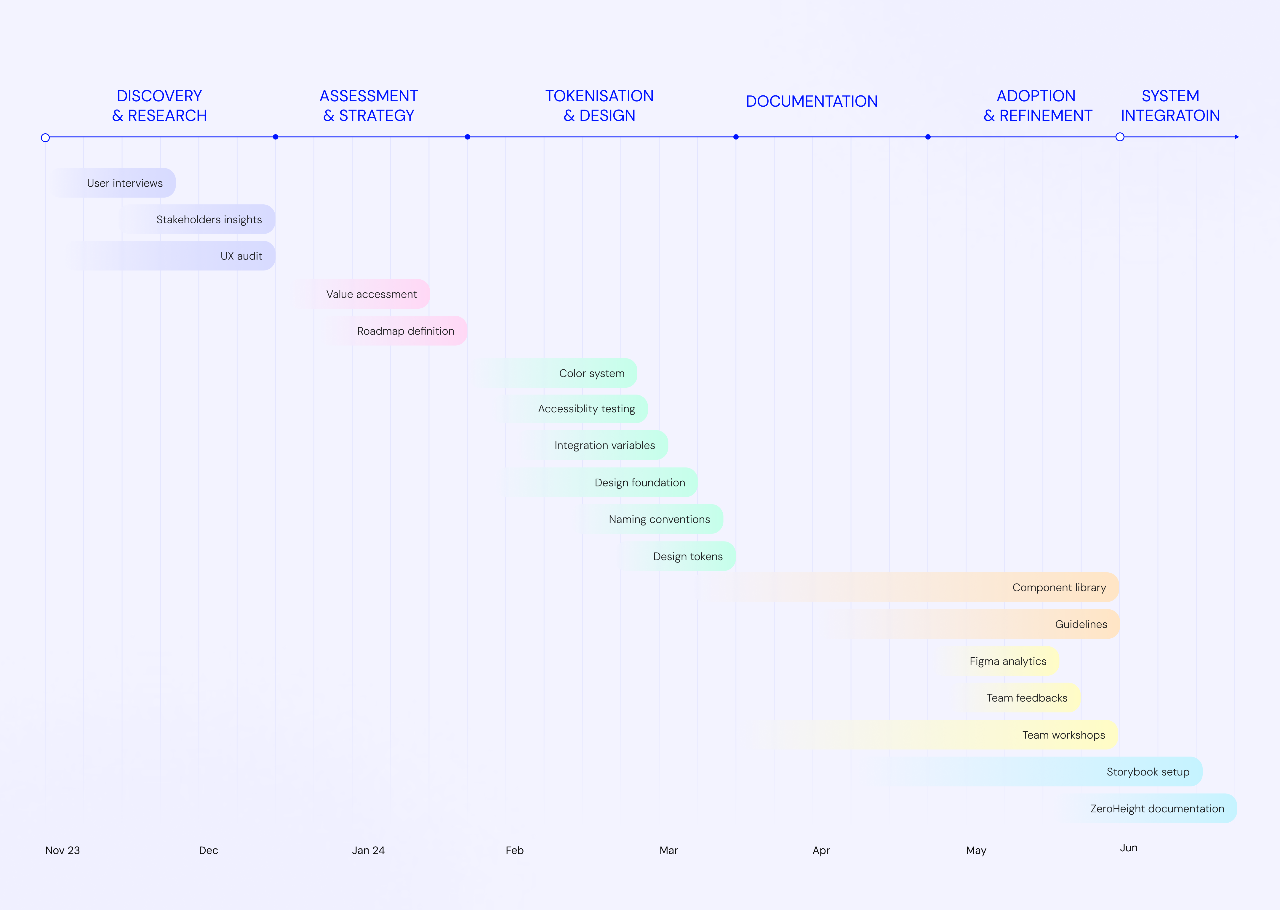
Context
Egerie is a Cyber Security startup provide Risk Management Solution SaaS. With the exponential growth of Egerie, the company faced significant challenges in maintaining a consistent user experience across its products. The absence of a unified design philosophy or guiding principles led to a fragmented UI/UX, with each feature or page designed in isolation by different teams over time. To address this, the decision was made to establish the Egerie Design System — a scalable and structured approach that would provide consistency, streamline development, and enhance the overall user experience across all products.
Project Impact
-52%
UI inconsistencies
+40%
Component adoption
-30%
Design iteration time
+60%
Figma component usage
Challenge
The lack of consistency in product design is causing issues such as a fragmented user experience, inefficient decision-making and diminished user satisfaction. These issues stem from a lack of unified design principles.
Solution
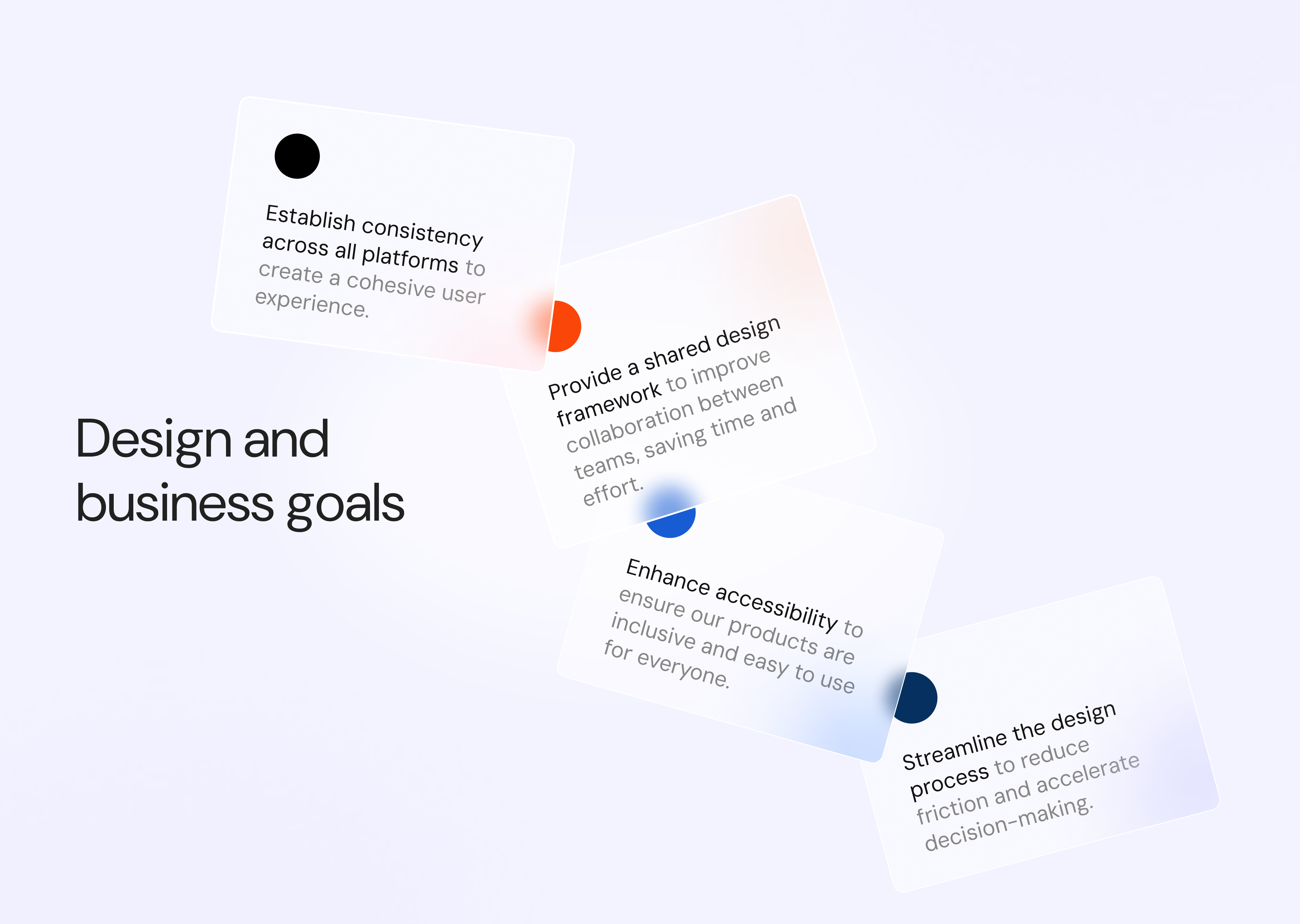
Establish a unified design system that aligns product efforts, streamlines decision-making, and ensures a consistent, predictable user experience across all platforms.
Result
A consistent and seamless user experience across products, improved decision making, increased user satisfaction, time savings through better collaboration, smoother code integration, fewer design and development errors, and a scalable system that supports future growth.
Problem statement
How might we resolve the inconsistency in product design at Egerie, so that teams can work more efficiently, improve user satisfaction, and scale with a unified design system across all platforms?
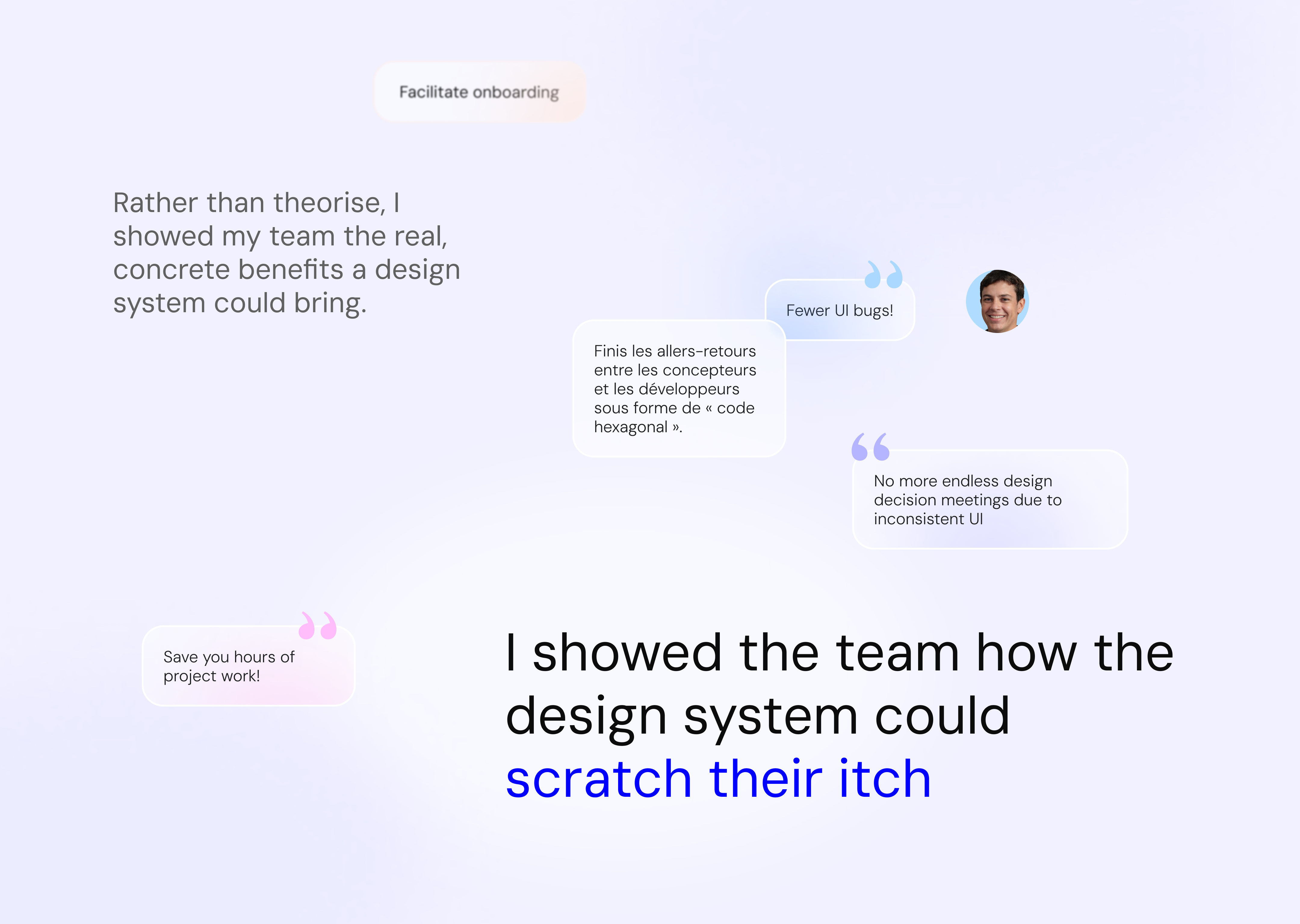
A get-buy-in process
In a start-up where UX design is not yet a top priority, getting stakeholders buy-in is challenging. I followed a patient approach, first understanding their pain, then showing them the potential benefits before asking for their support.
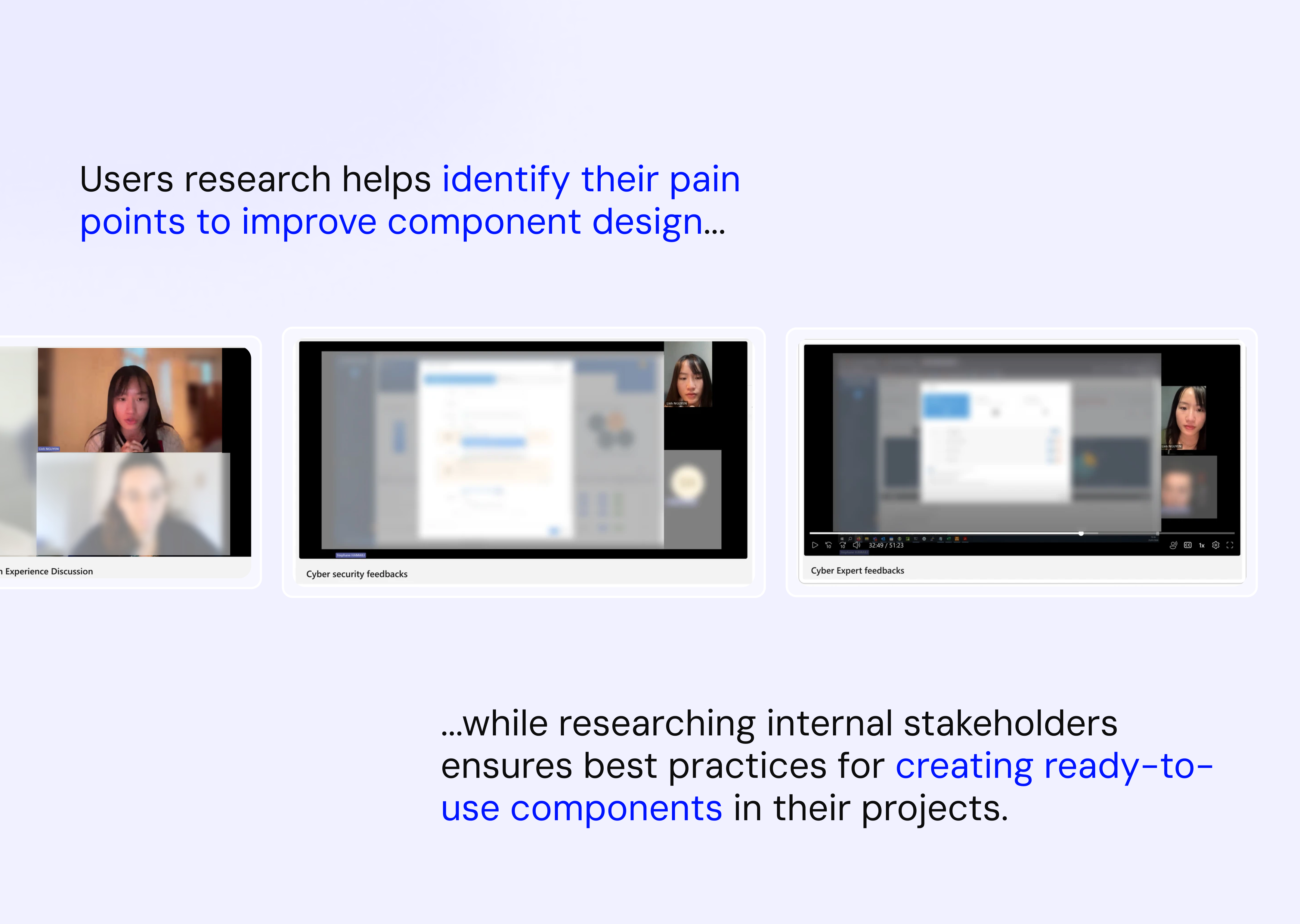
Research
I conducted interviews with designers to understand their workflows and frustrations, consulted with cyber experts to identify inconsistencies, and spoke with the presales team to gather customer feedback. I also analysed issue tickets to identify recurring issues, which helped me gain a clear understanding of the challenges.
Key issues
Users: Cyber experts highlighted confusion caused by inconsistent layouts and components. In addition, 72% prefer to use the dark mode, but it's only available on a few pages
Designers: All designers expressed frustration with having to repeatedly create similar components and adapt to inconsistent layout of the app. The lack of a standardised design system makes decision making difficult.
Developers: 75% of developers noted that unclear or confusing handoff processes led to time-consuming back-and-forth with designers, increasing their workload and contributing to technical debt, which is a major concern in Egerie's development process.
Value assessment
To gain support, I connected with with key people - who would appreciate the value of design system, like my Design Lead from Design Team and the Tech lead from developer team. They then influenced their respective teams.
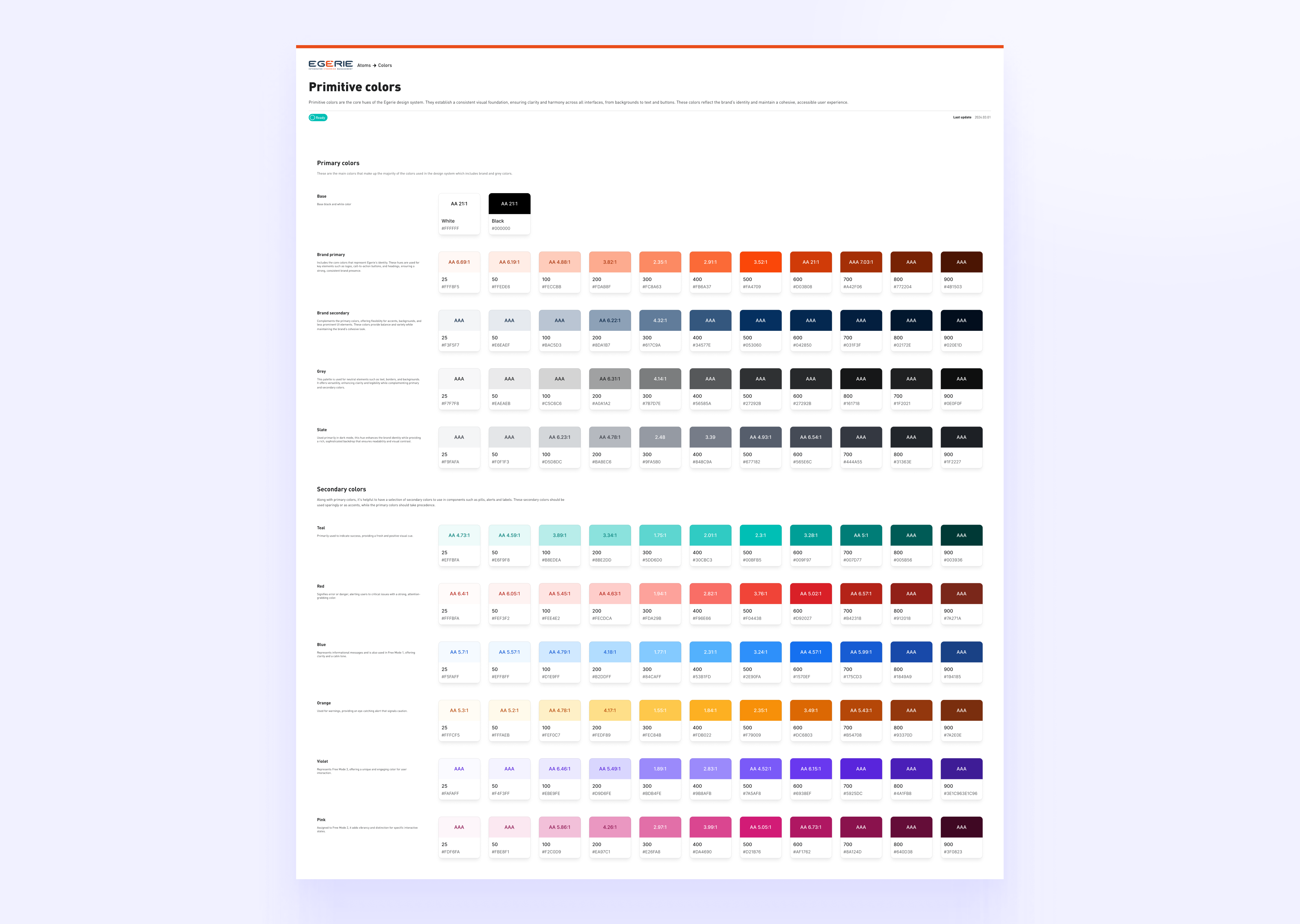
Color system
To build an atomic strategic design system, I started with the color system. This foundation was essential, as my heuristic analysis revealed serveral issues: inconsistencies, redundancies and misuses of color across the platform.
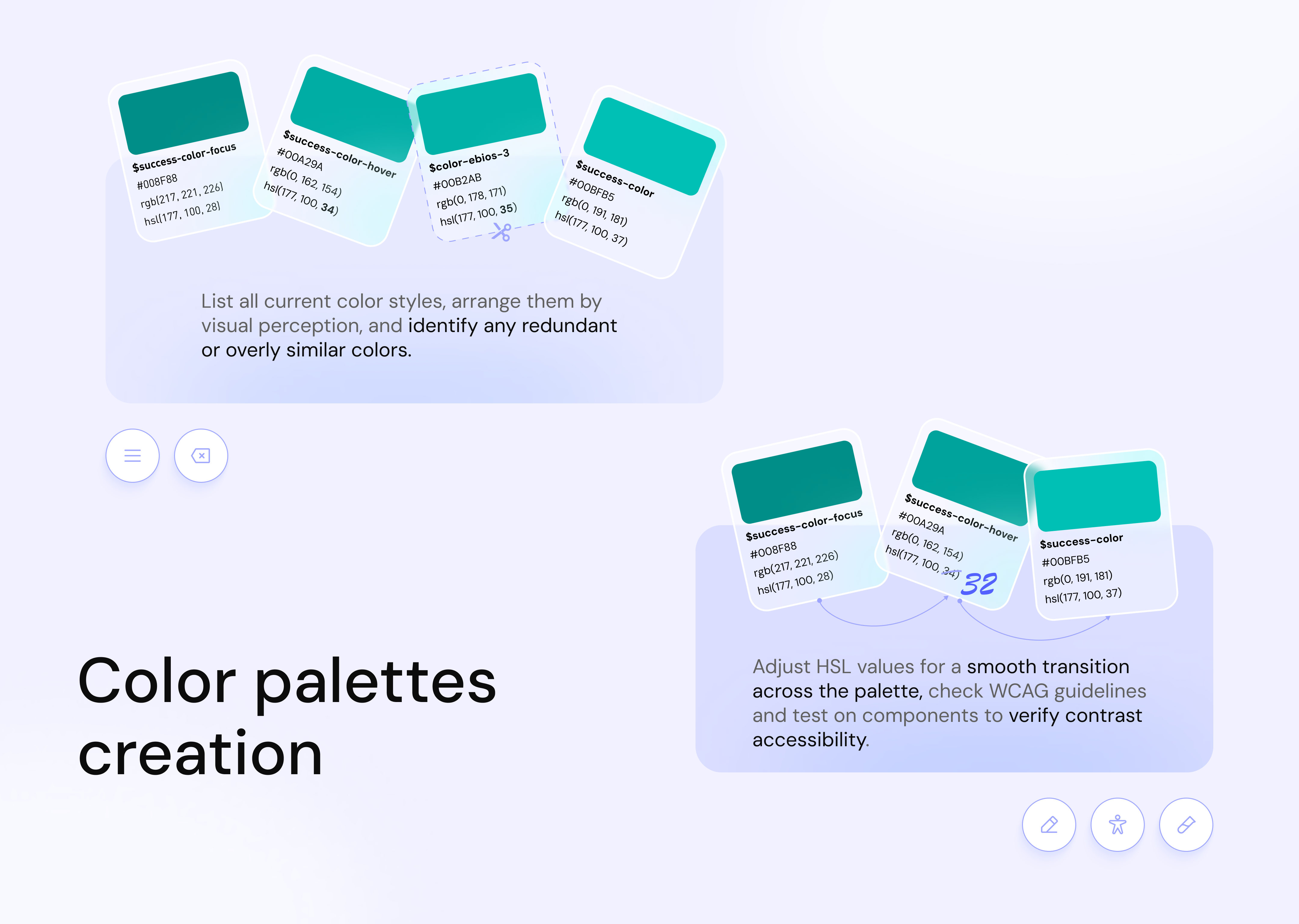
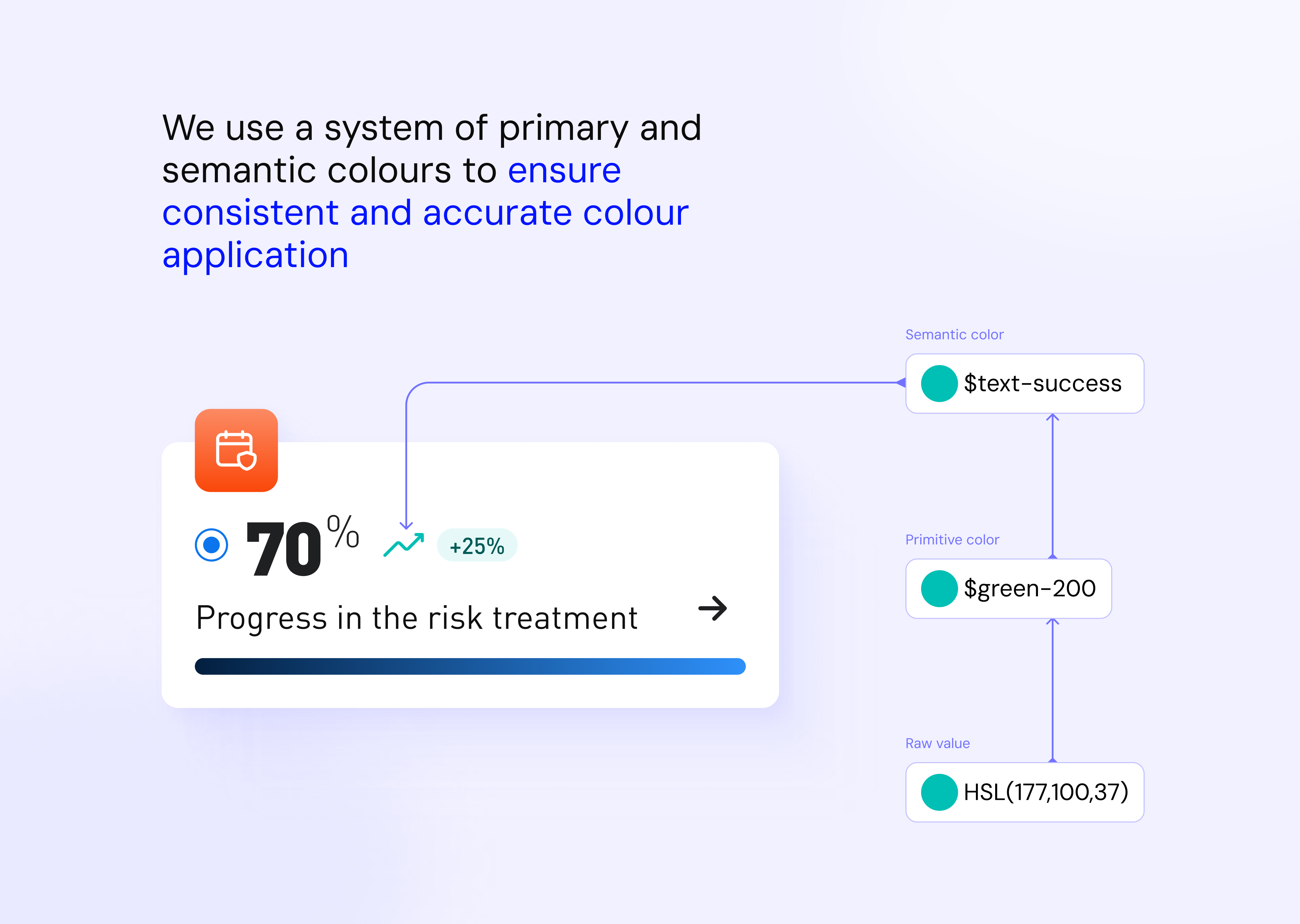
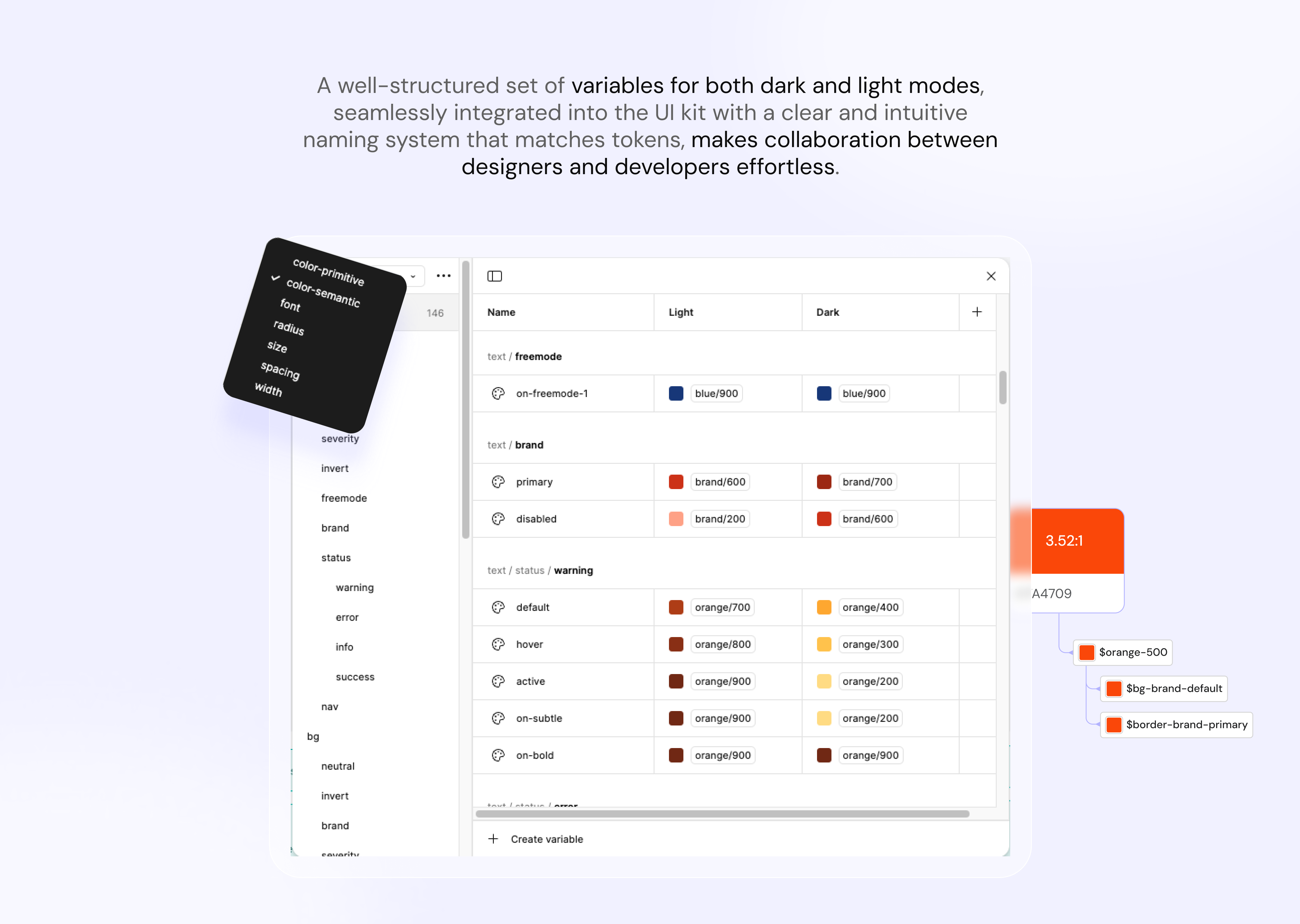
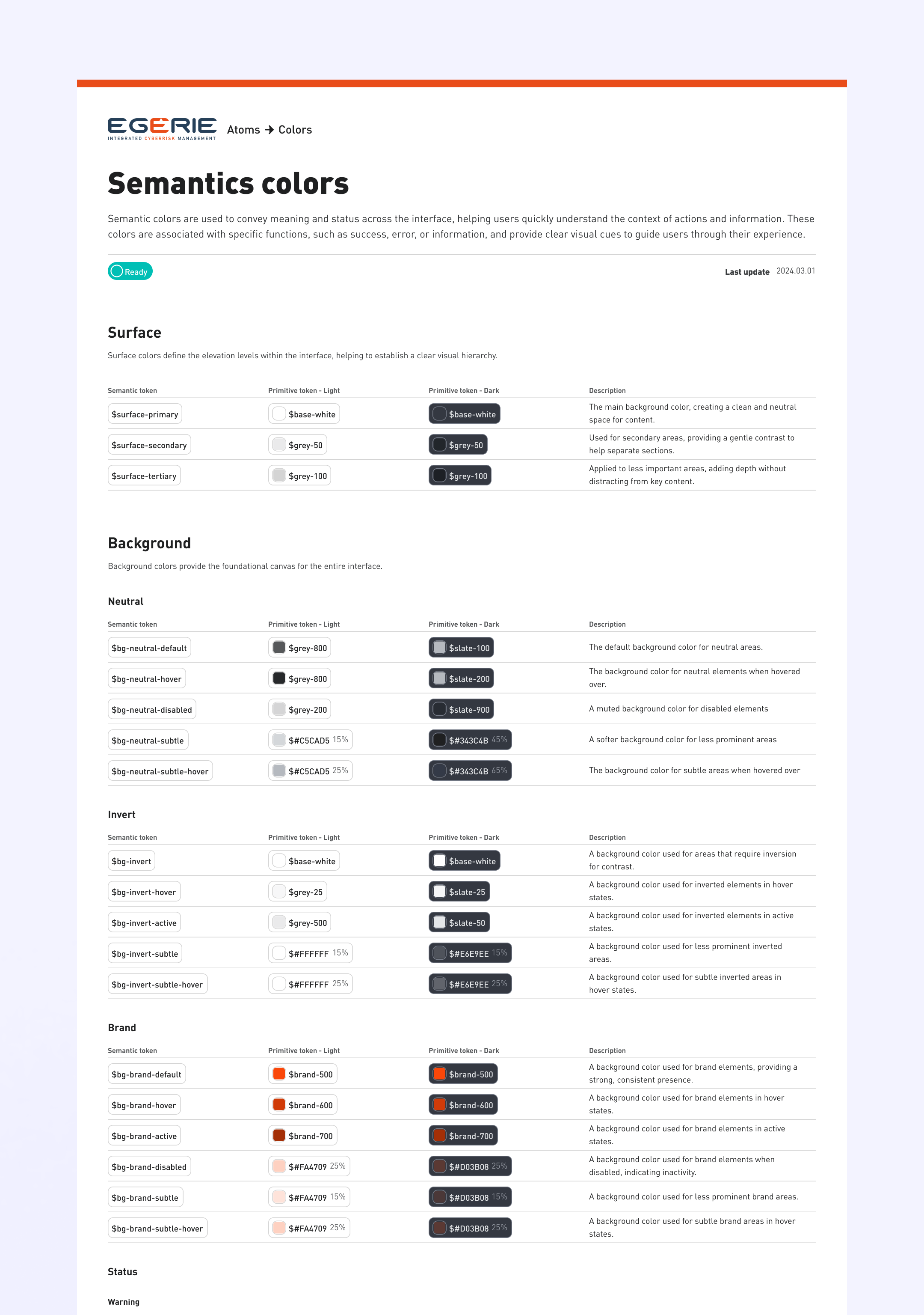
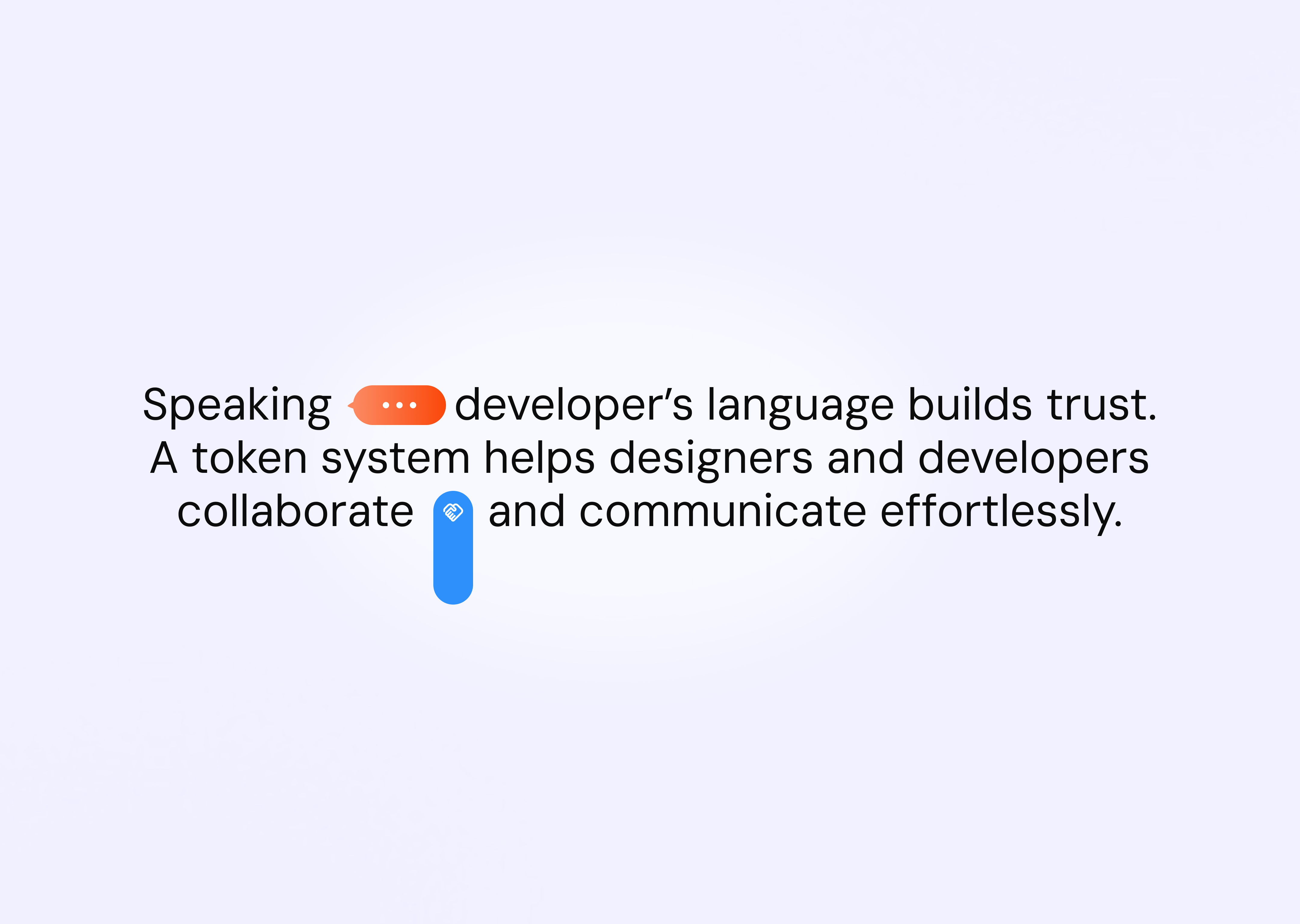
Tokenisation
This method provided a clearer understanding of the intent behind each color, enabling developers to interpret and apply them effectively. It also streamlined the process of making updates to the system when necessary.
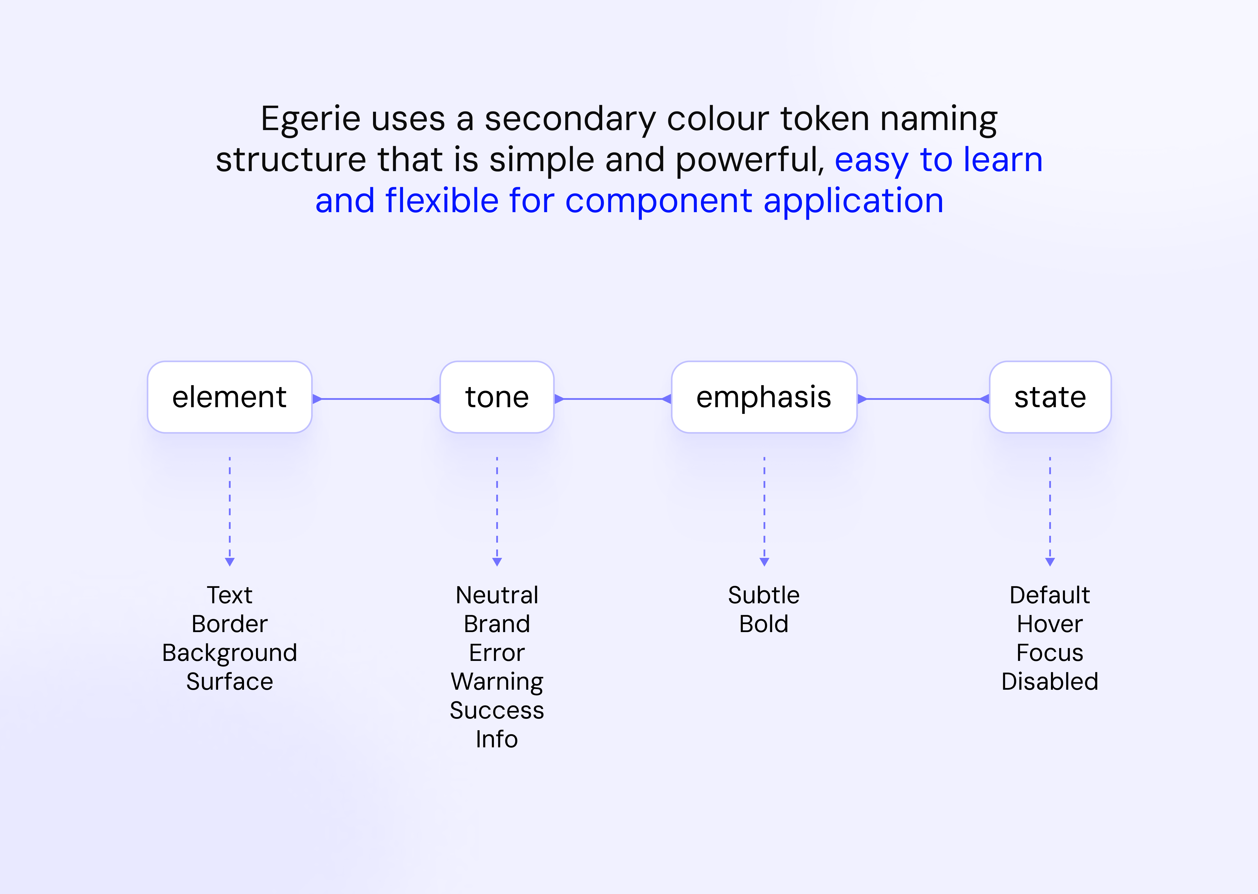
During this phase, I'm extensively collaborating with the development team to establish an optimal naming convention for tokens. This ensures that when implementing the new color system, it minimizes the workload for both development and design teams while ensuring clarity in the purpose of each token.
I have software engineering base so I worked closely with developers to establish tokens code bases.
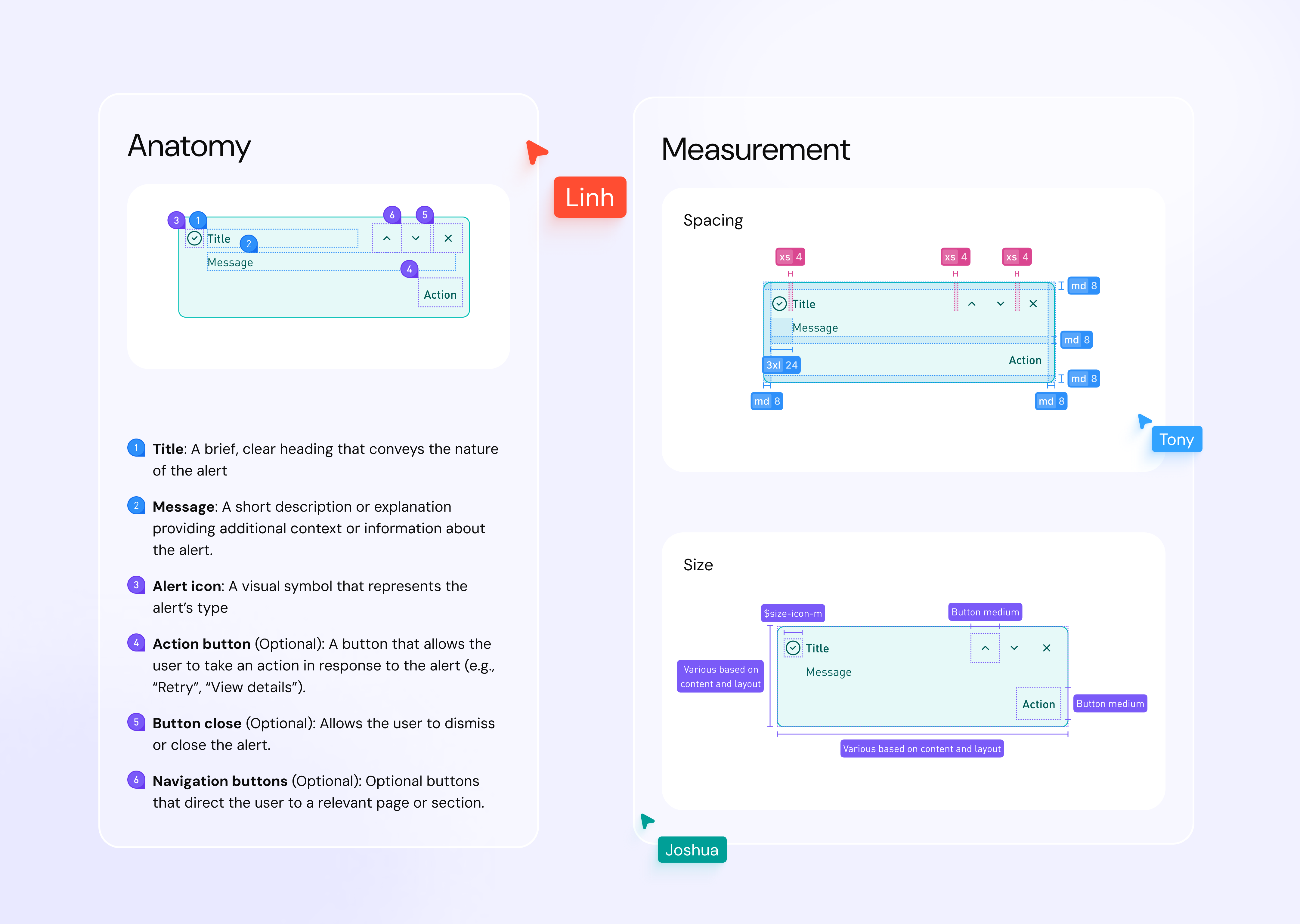
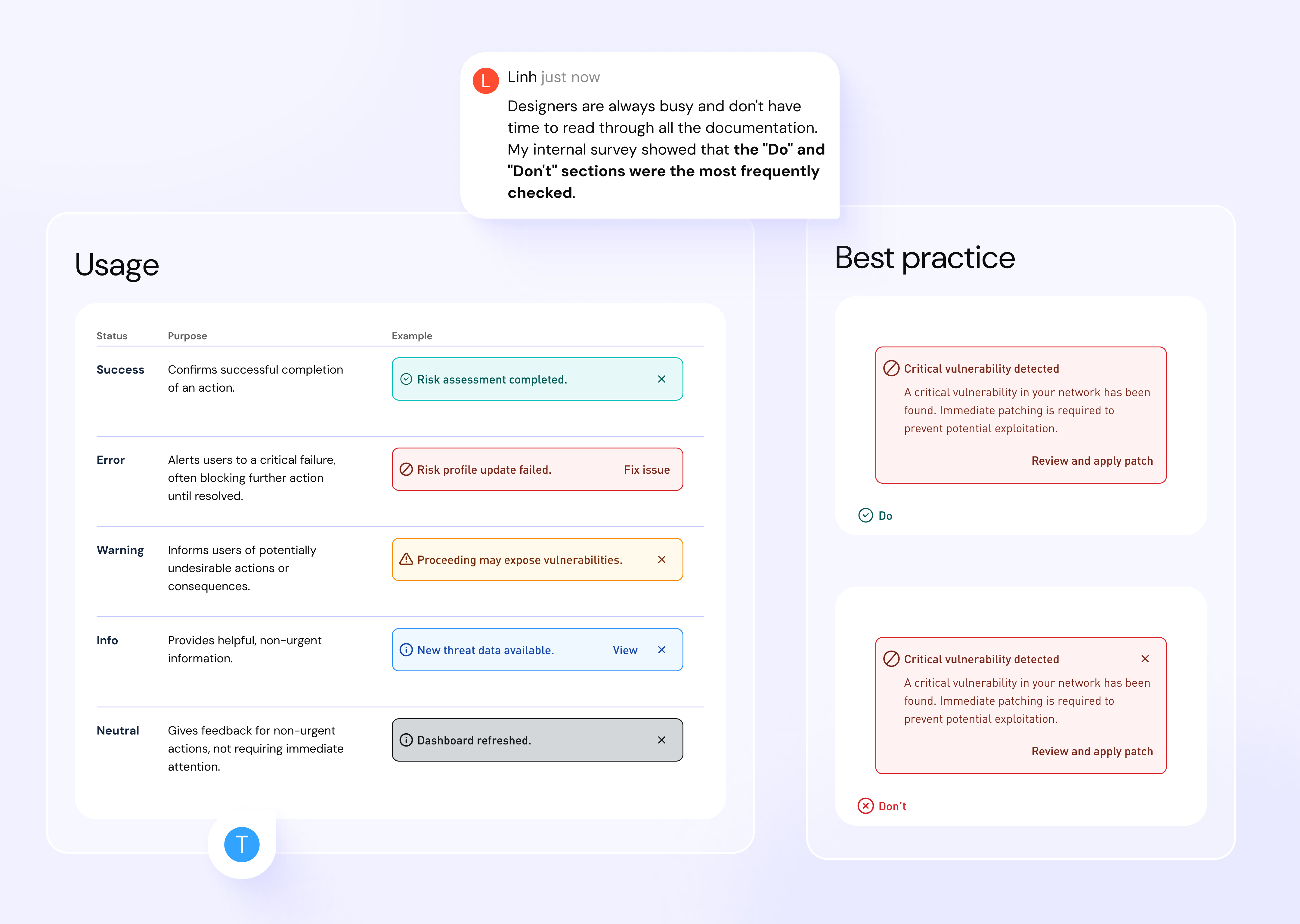
Documentation
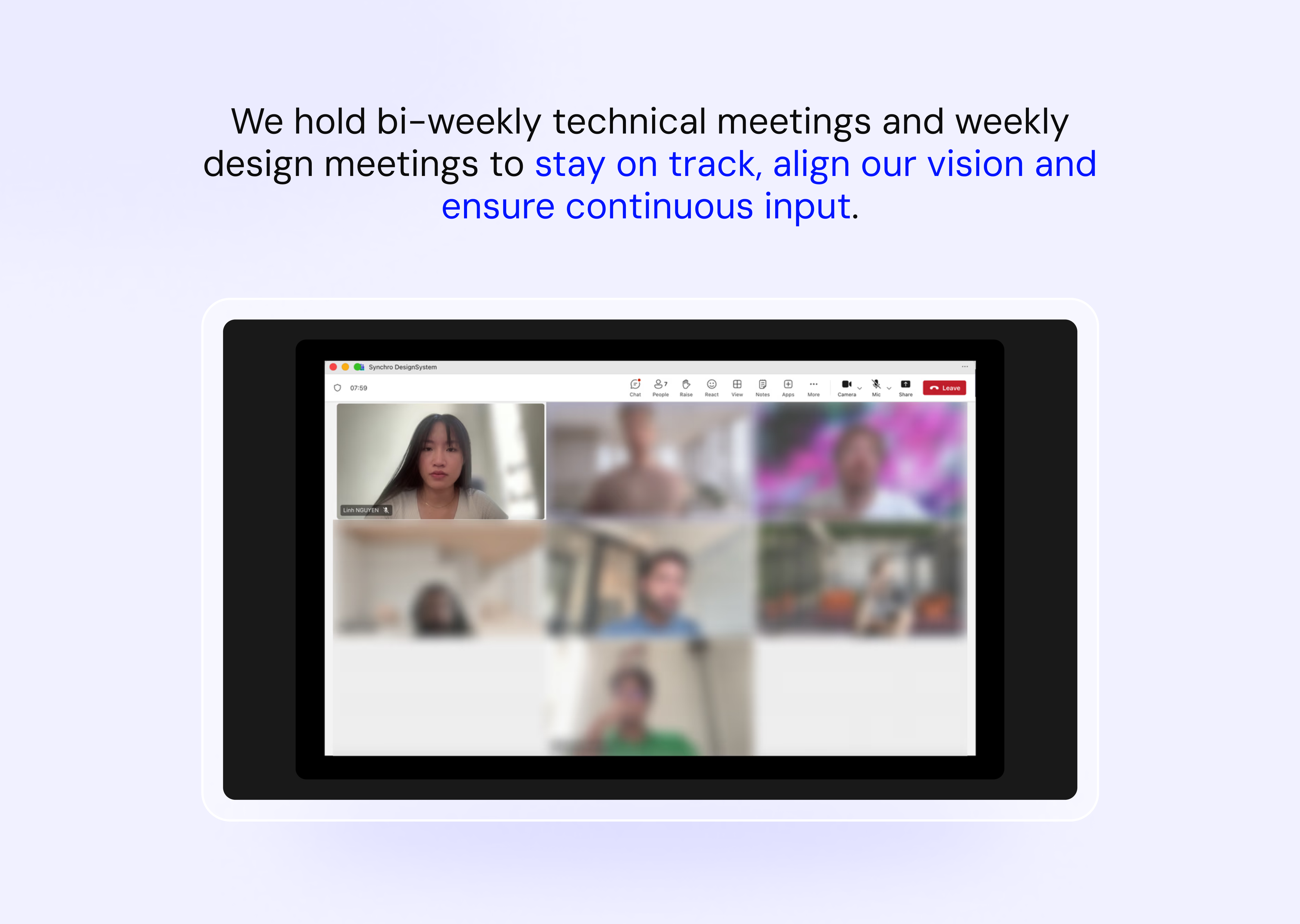
Initially, I worked alone on the documentation, asking designers about their challenges and the reasoning behind component choices. I would redesign components and gather feedback during team meetings to refine them.
However, I quickly realized the importance of involving the team to build a stronger connection with the design system. By collaborating, we conducted research and established best practices together, fostering a sense of ownership and deeper engagement. We then listed the components and divided them among the designers, significantly enhancing teamwork and collaboration.
Manage adoption
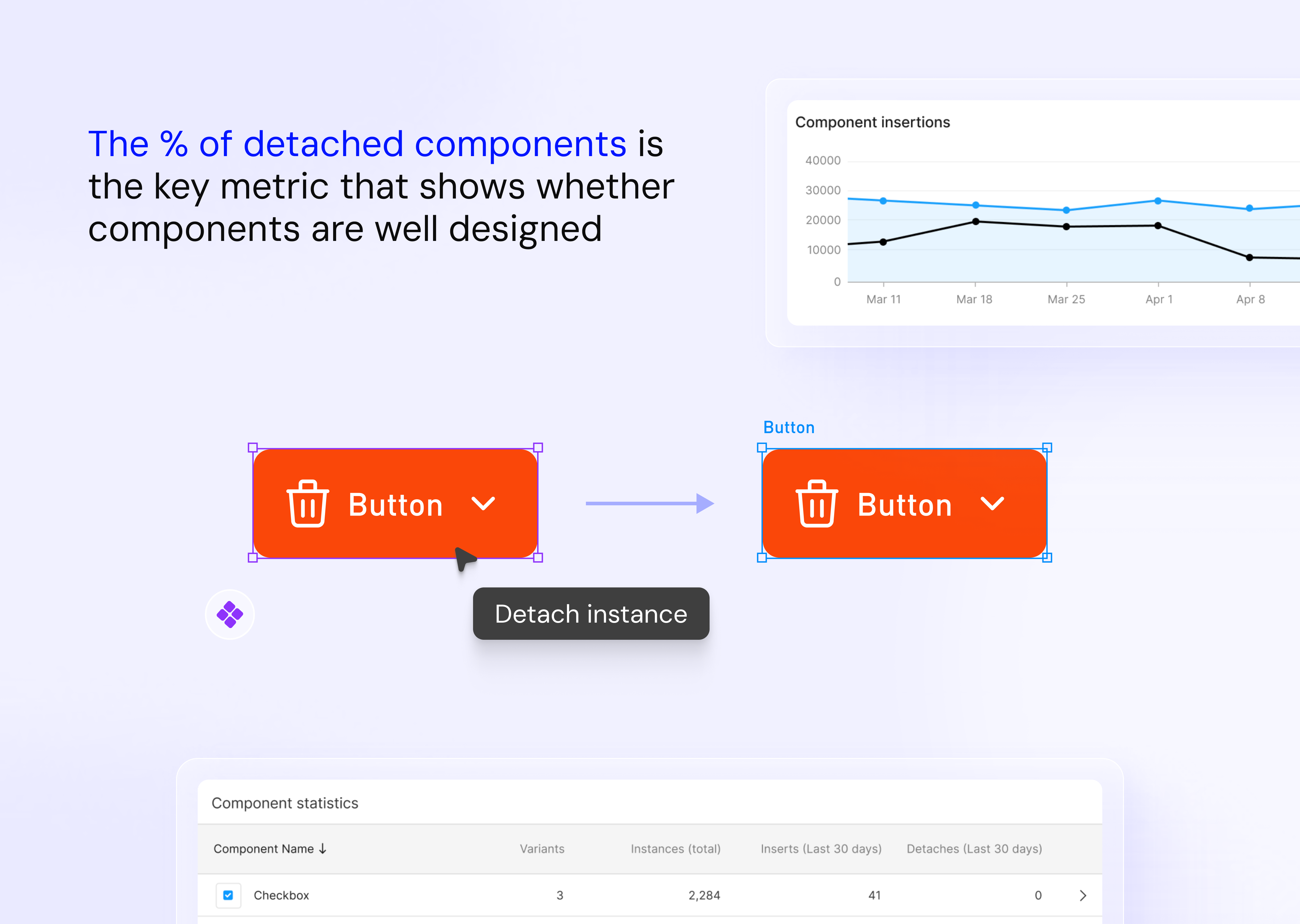
To track how the team was adopting the components, I used Figma analytics. If components were often detached, it was a sign they weren't quite meeting the team's needs.
What I learnt
If you want someone to participate in your project, especially in a startup environment, remember that everyone has their own priorities, projects, deadlines, clients waiting. Your initiates will have to contribute in order to reduce their workload or the company's budget. Treat them like your users: Find their pain points, show them how you and your ideas will help them.
Try to define the goals of your system and your MVP. This will help you make more effective design decisions and focus your efforts. Frequently update the process and divide tasks among them; the more they contribute, the more meaningful the project will be to them, so they will tend to put in more time and effort.